During Mobilia’s Design Circus, Union sat down and spoke to Spanish-born architect and industrial designer, Patricia Urquiola.
Time Shouts
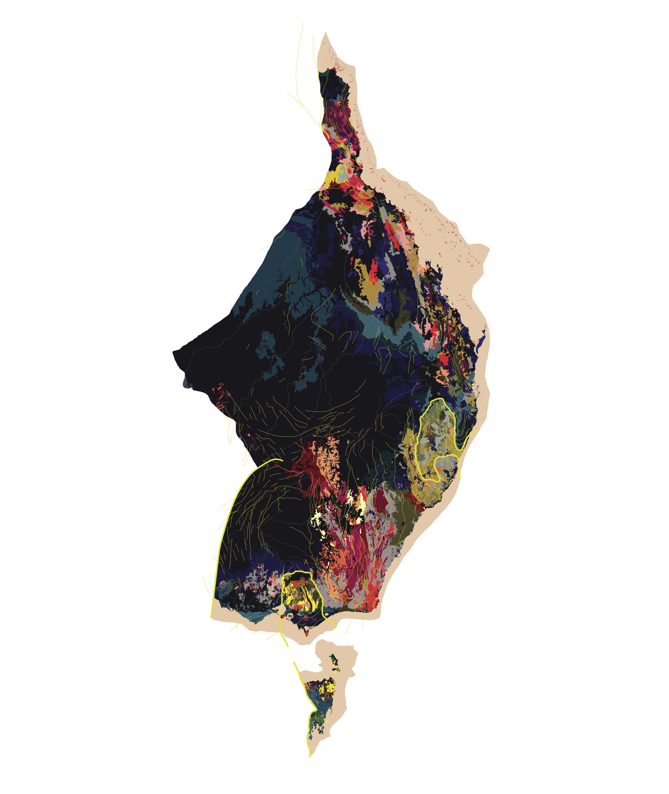
Challenging the perception of Australia as a uniform, static landmass, Time Shouts, the 2021 winner of the Australian Tapestry Workshop's Tapestry Design Prize for Architects, reveals deeper geological and cultural relationships expressed through the materials and processes of tapestry making.
Essay
Emma Jackson
Photography
All images courtesy Emma Jackson/ Ground Under Repair
I am uncompromising about increasing and prioritising geo-cultural literacy through my creative practice. If you examine Australia’s suburbs, cities, and farmlands, it certainly would appear on face value that we have treated this ground as a benign substrate, into which we have transplanted ideas from somewhere else. Geo-cultural literacy would enable architects, urban designers, and town planners to understand the context they are building into and be appropriately responsive.
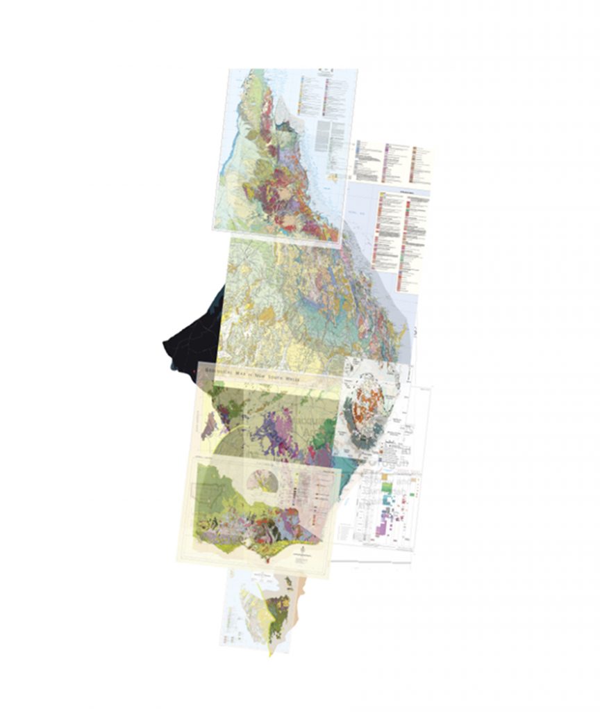
The design strategy behind Time Shouts was initiated through my PhD research at RMIT Architecture, which looked at occupation in the north of Australia that more appropriately responds to our climate and our culture. In trying to understand the structural history of the north, I was attempting to read its story through geological maps. At the same time, I was looking at maps of Aboriginal language families so I could acknowledge a human cultural connection. Eventually, I overlaid one across the other and found some very beguiling patterns. The interlocking stories are unmissable. It occurred to me that geology could be the vehicle that initiates discussions about how we care for this unique continent.
Tapestry seemed an exciting medium for the work; literally weaving geology and language together to formalise their strong relationship. I engaged a small team of aspiring geo-cultural architects to help me draw up this tapestry for the ATW competition. We overlaid all the geological maps we could get our hands on, and traced and retraced until we had a diagram of geological behaviour
The experience of designing this tapestry, as is most of my design practice, is more akin to storm chasing or a detective wiretap. I always felt we were on the verge of the great discovery; there is nothing like having a disproportionate idea of your own impact. The adrenaline of this, deluded or otherwise, was a great antidote to lockdown. My weekends were spent pouring through geological maps, books and research papers to try and understand the structural logic that would describe the behavioural patterns.
Throughout the design process my fidelity was torn between truth and story. Fidelity that favoured geological convention, tempting as that was, would tip the tapestry design from artwork that hangs in an art gallery, to artefact that hangs in a museum. It was a tender balance that I nurtured throughout the whole design process. As it turns out, navigating this fine line between fact and fiction, is something that scientists do every day. The truth is always changing, so mapping something exactly can depreciate its relevancy. The best way to capture the changing truth is with a narrative.
The representation of dialect lines probably took the longest time to settle. It was important that the lines not be too line-like. I wanted to depict a ‘not sure’ quality to the location of Aboriginal language and groups, to acknowledge what can’t be ‘known’. This clarifies my intentions, that the creative work does not claim to locate accurately either the geology, or language, rather to illustrate the strong cultural relationship between the two.
One of the perceptions that I wanted to challenge was that Australia is one uniform, static landmass. The shape, composition, and relationships, of our continent are constantly changing. Fault lines, fold lines and volcanic activity, tell a dramatic story of continental gate crashing. The shape, colour choices, and each conditions of the tapestry design responds to and emphasises this behaviour.
Colour selection was being revised right up to final submission. A slightly tweaked colour could reveal an entirely different picture. There were times where I needed to loosen my fidelity to geological convention to enable me to reveal the behaviour.
The tapestry was deliberately designed to look like it had been ripped out of Australia, like an organ from a human chest. The edges of the work depict the physics of this extraction; where there are long fault lines the tapestry comes out clean, and between fault lines there is a rough fringed edge. Where faults extend beyond the edges of the tapestry, they hang loose, like veins might, from a heart.
Time Shouts disrupts our perception of Australia as one uniform static landmass, carved (ir)rationally into states and territories, and reveals its deeper geological and cultural stories. The critical ideas I wanted to communicate in this work were the relationship between Aboriginal language and geology, and that the land we call Australia is alive, kicking, and in a constant state of conflict and change.
The Tapestry Design Prize for Architects is an international award that challenges architects to design contemporary tapestries. The winning design for 2021 will be produced by The Australian Tapestry Workshop and has been designed for exhibition at Phoenix Central Park designed by John Wardle Architects and Durbach Block Jaggers.
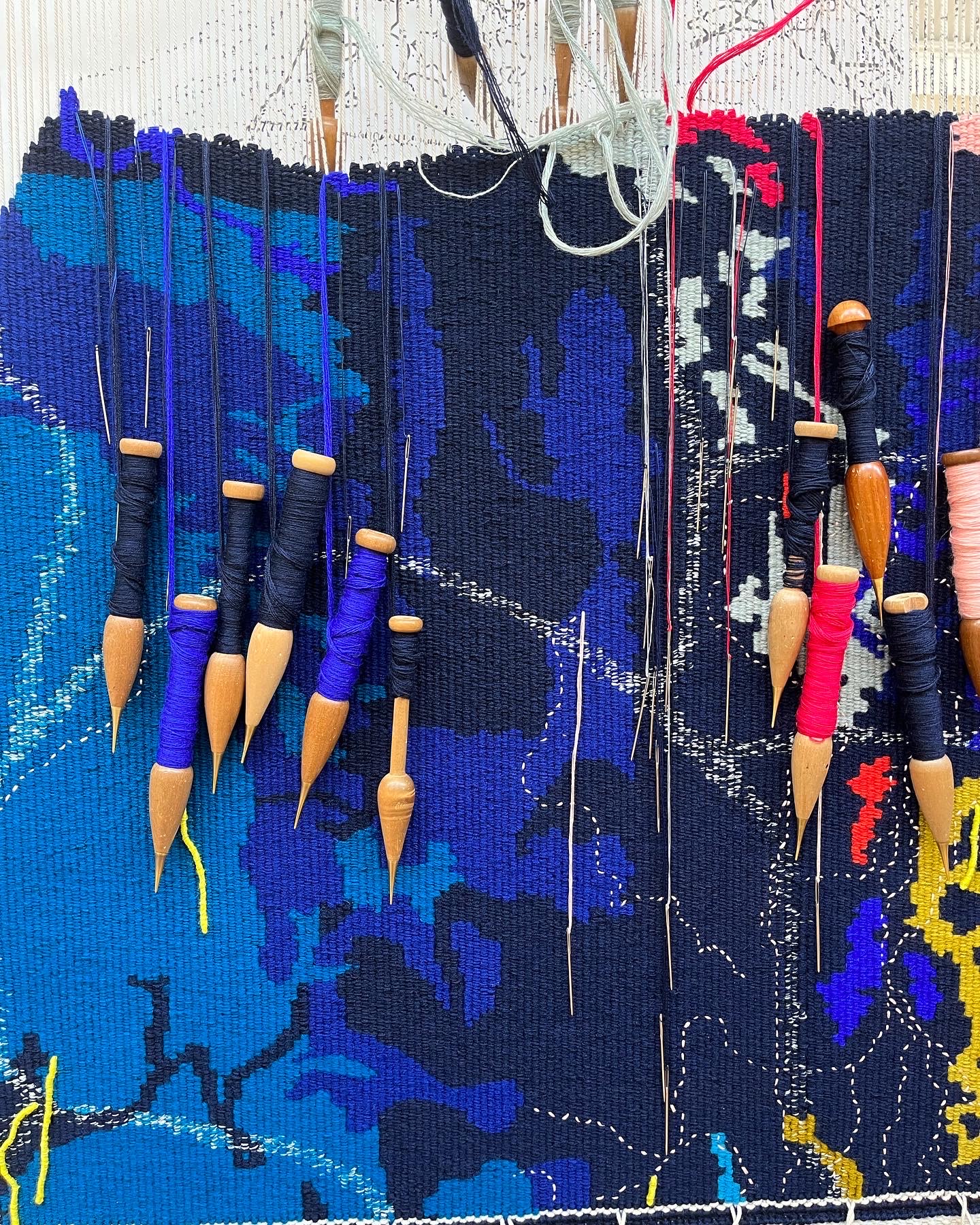
Time Shouts, tapestry sample
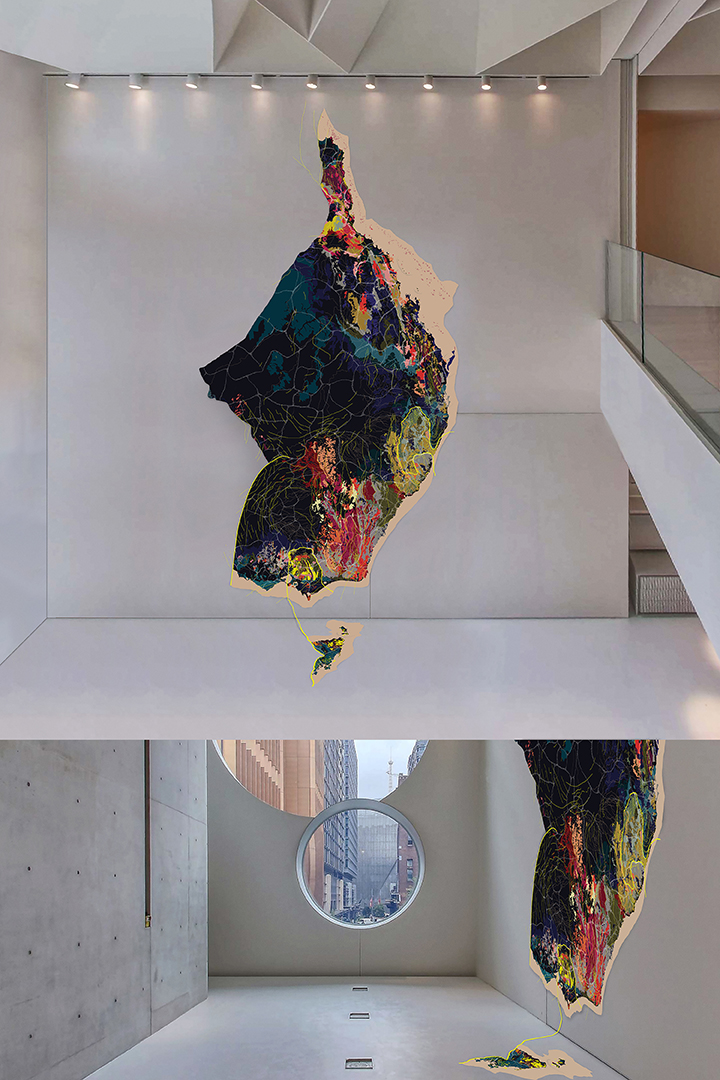
Time Shouts will be produced by The Australian Tapestry Workshop and has been designed for exhibition at Phoenix Central Park designed by John Wardle Architects and Durbach Block Jaggers.

