Renowned for their longstanding collaborations with design visionaries such as the Eames Office and the ground-breaking Studio 7.5, Herman Miller has...
ARTICLES
JACQUEMUS OMA/AMO SCULPTED SOFTNESS
French fashion house Jacquemus has partnered with international architectural firm OMA/AMO to materially evoke Provence in the heart of iconic Parisian and London department stores.
Essay
James Taylor-Foster
Photography
Benoit Florençon
Jacquemus is a fashion brand that is of its time: regionally global. Emphasising the fact that the roots of the brand are deeply entrenched in the heart of Provence, via Paris and through founder Simon Porte Jacquemus, the eponymous label is known for simple cuts and southern-French colours. In 2020, a decade after its founding, a magenta coloured SS20 runway entitled Le Coup De Soleil (sunburn) stretched along the plumb lines of a lavender field in Valensole. The invite to the show took the form of a travel-sized bottle of suntan lotion.
Today, labels like Jacquemus – those linked inextricably to a person, a personality – are relatively mainstream. What makes it a cut above, however, is its turnover. As far as fashion lines go, the brand makes money. One sign of this success has been Jacquemus’ capacity to expand out from the social media grid (where it continues to be phenomenally successful) into IRL – which they did in 2022. Working with OMA/AMO, led by architects Ellen van Loon and Giulio Margheri, the creative teams designed and realised three ‘shop-in-shops’ in Paris and London.
The retail spaces located in the Galeries Lafayette Haussmann, Selfridges and Harvey Nichols are all very different. At the same time, there is a shared tone. Working in the department stores’ cubicle-like, highly-regulated conditions, there was little need to acknowledge any built context. Like any marketplace, these sorts of places demand that the designers hijack the space they are allotted. Against the backdrop of a carnival of similar outlets, they are challenged to offer the most particular experience for customers. The context for each Jacquemus interior is the brand itself – the geography, image and idea of Provence. This has necessitated an architectural translation of the label into built space, creating environments that work to concretise the brand, entice potential customers and ultimately sell garments.
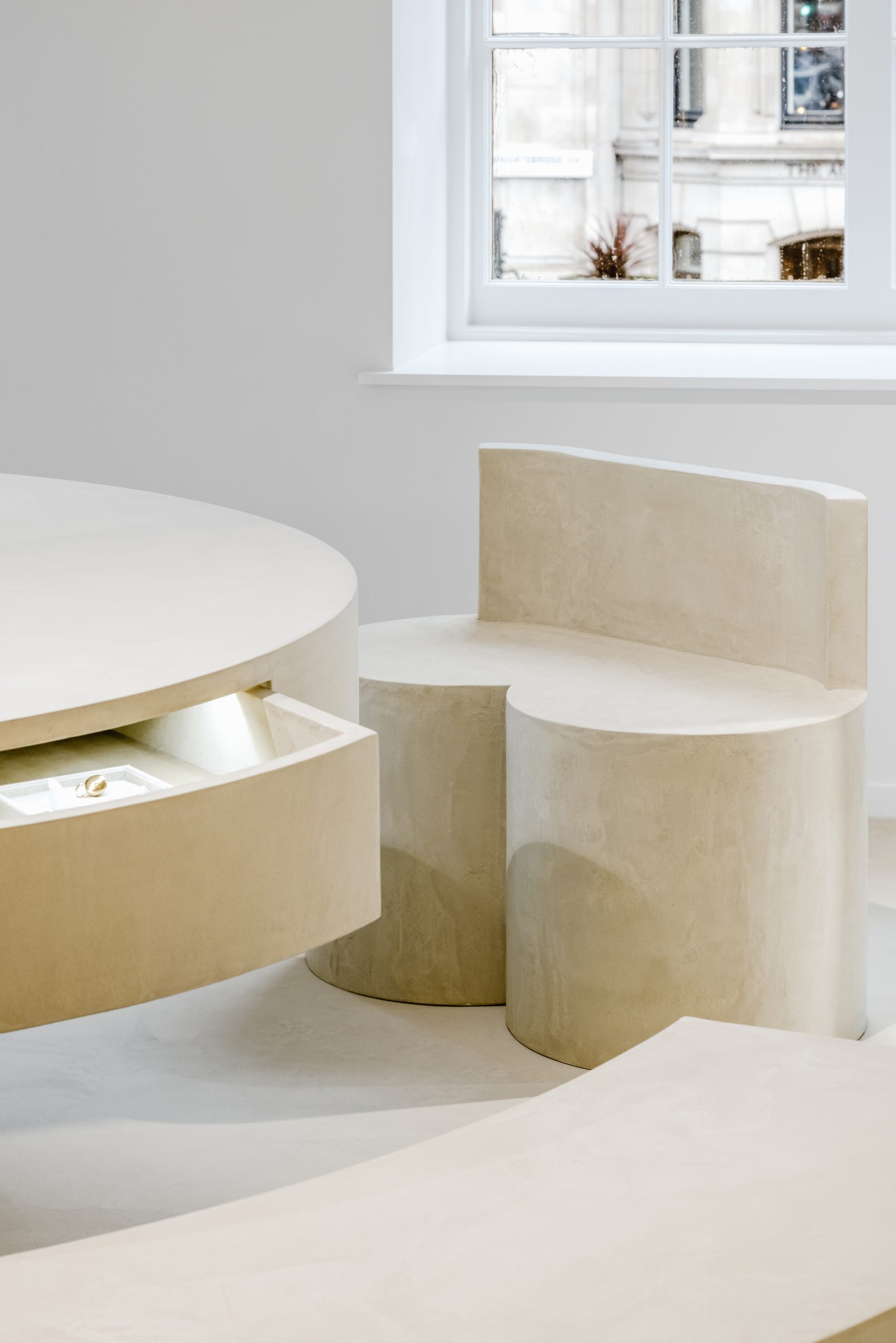
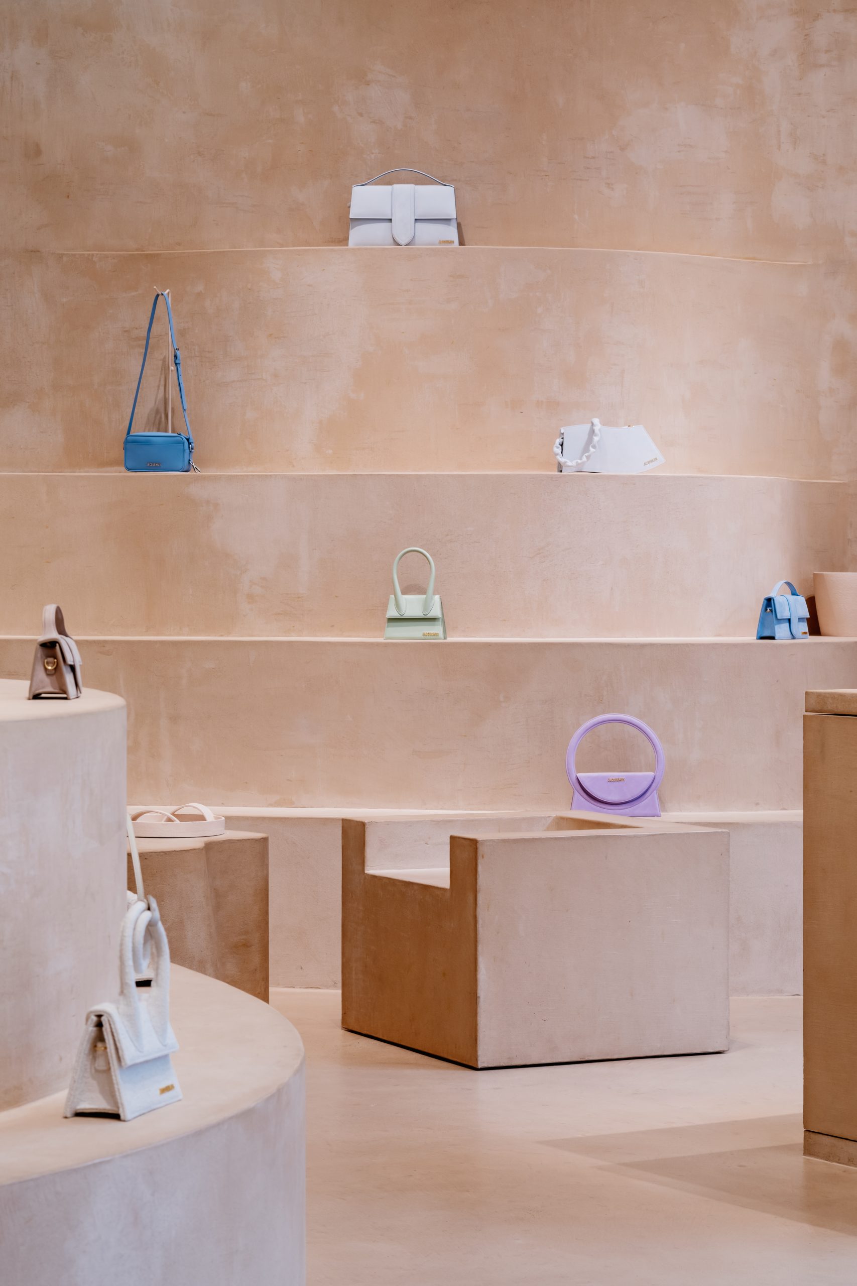
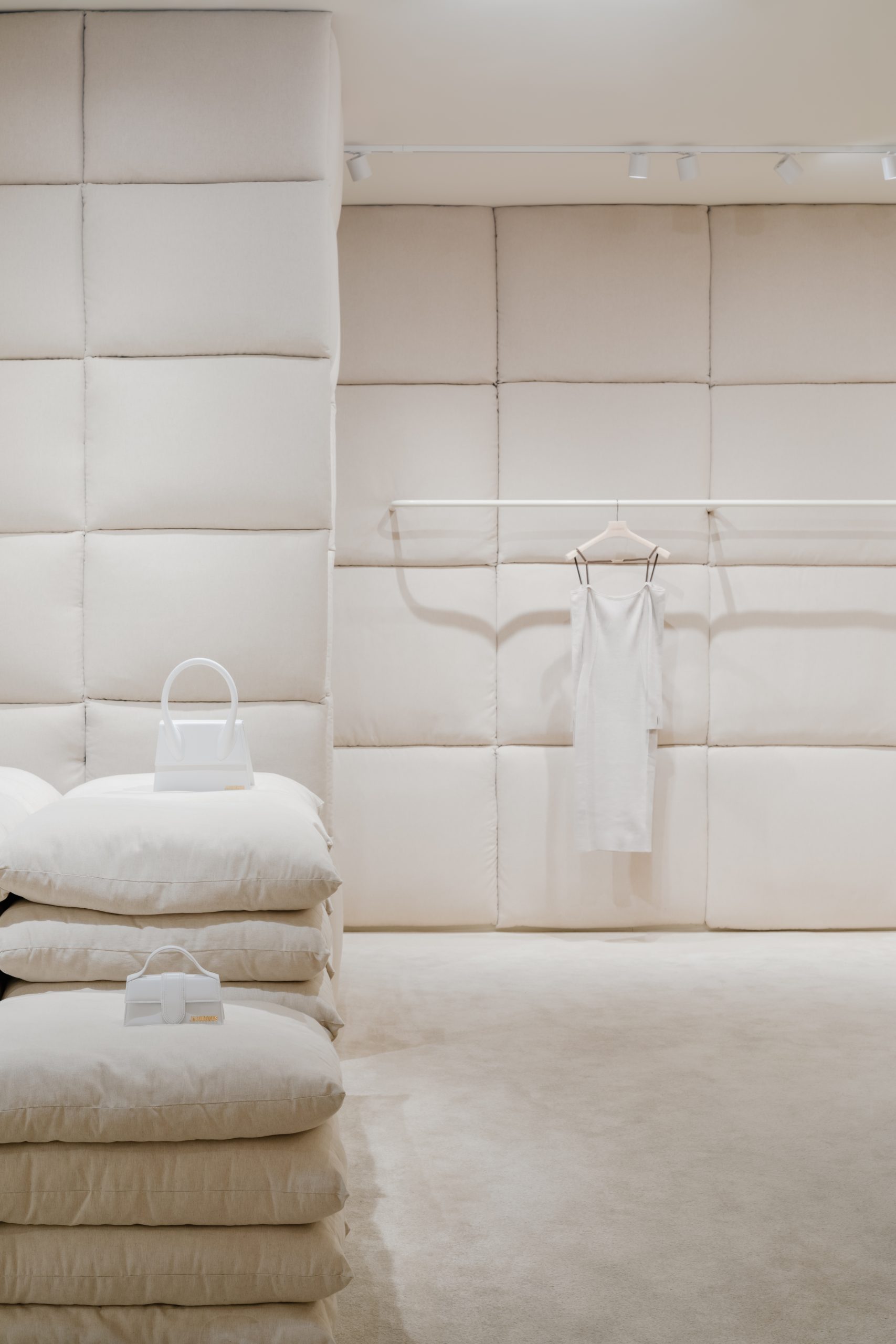
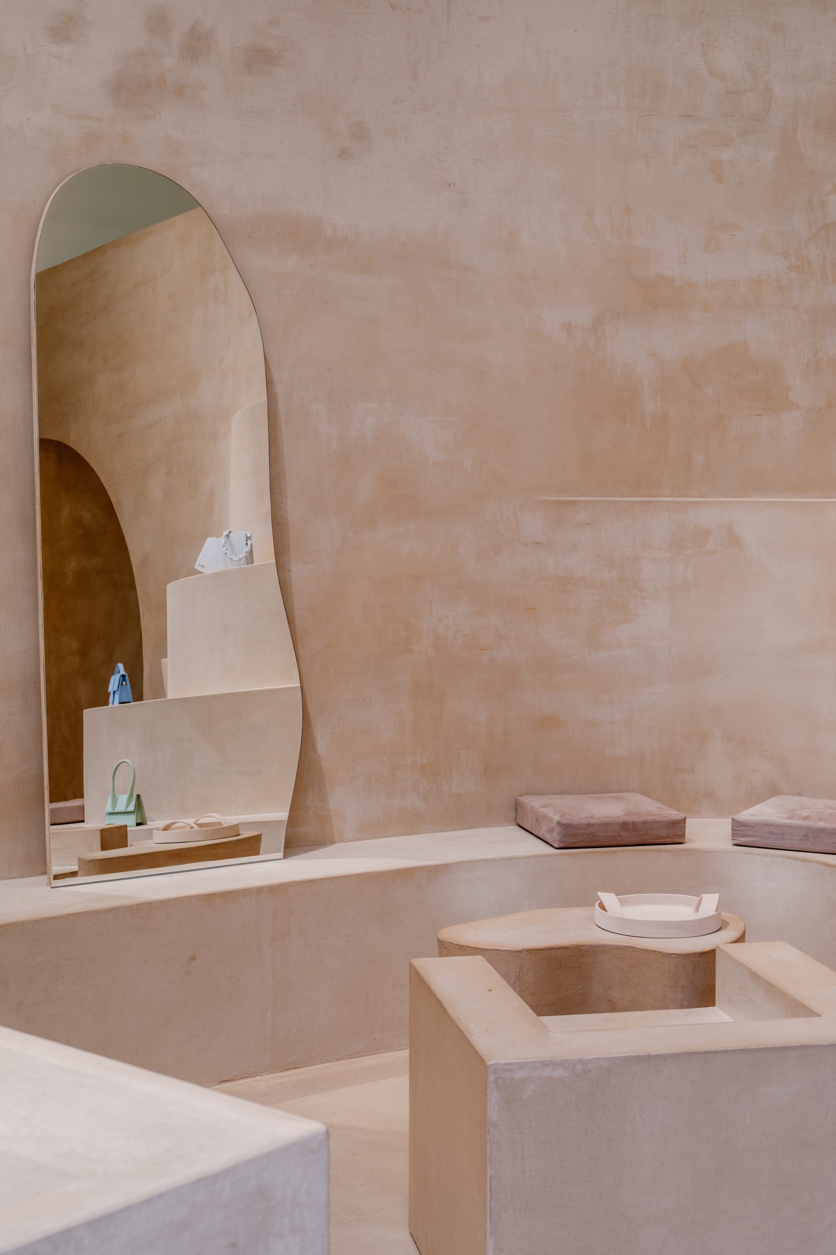
The three sculpted environments that have emerged from this process are distinct but cut from the same cloth. The 82 square-metre ground-level boutique at Selfridges in London – a space featuring a large storefront window – is hand clad in a ceramic material known as terracruda, which functions as an abstract image of sun-baked clay and straw. In material contrast, the 60 square-metre shop at Galeries Lafayette is encased, quite literally, in linen pillows which, either stacked as seats or shelves or operating as panels, evoke the unsettling feeling of a padded cell. Alongside the store at Harvey Nichols, which incorporates limestone-clad concave walls that braid ceiling to floor, all three interiors are carefully stripped-back almost to the point of dysfunctionalism. This is an architecture of wrapping, swaddling and surrounding – and it is, for the most part, highly seductive.


Recently, retail design has undergone a spectacular mirror-gawking moment. Exacerbated by the Covid-19 pandemic, shoppers have become less inclined to travel to a store. The services that they offer are available everywhere. While the wealthy have not stopped spending during recent years, the retailer’s urge to create ever more memorable shopping experiences can be seen the world over. For The Webster’s latest flagship store in Los Angeles, Adjaye Associates carved a spectacular structure of red and pink hues out of the Beverly Center – a rather quiet, once-fashionable monolithic mall. From the curved display windows to the Hollywood-esque fitting rooms, replete with stage and spotlights, the project represents a concerted, design-driven attempt to get people through the (large, axis-spinning concrete) door. Is it a gallery, you wonder? Can you touch the products on display, you tentatively ask one of too many personal shopping assistants? Where is the cashier?
The three Jacquemus shop-in-shops are less extreme, but still a definitive part of this trend. They toe the line between projecting a sense of fashionable authority and embracing the ambitions of the brand, while seeking to be inviting, hospitable and parlour-like. In the Selfridges store, a cast table sits close to the large, street-facing window. Its function is ambiguous – not quite a plinth or display and yet not a place to throw your bags and take a breather from an exhausting day of buying. With the height and proportions of a dining room table, you can only wonder what its purpose in the room is.


The purpose, of course, is to promote a coherent brand narrative. By avoiding a sinking sun over rolling lines of lavender – the first thing that comes to mind when Provence is mentioned – the architects have chosen to sculpt three spaces that have a precise material clarity, doused in beige and light terracotta. This pale, earthy, mineral-based material palette – limestone, terracruda and linen – is subtle. In the words of Giulio Margheri, “You want to have a space that already talks about a brand before you see the products; we didn’t want to create guidelines.” Rather, the team initiated the project through material research. What emerged echoed the character of southern France, and was subsequently extruded into three narrative rooms with their own distinct material expression. “There was a recurrent theme of obsession,” Margheri continues, “which allowed us to transform everything into full environments.” And full, all-inclusive environments is the best description: in each space the material is everywhere, from floor to wall to ceiling. (The exception is Paris, for which pillowed floors were deemed a safety hazard.)
Deploying a single material across the entire envelope automatically creates a cloistered feeling which, in a retail space designed for comfort, is inviting. Allowing the materials to guide the form of the rooms, embracing the possibilities and limitations of each choice, is a relatively unique design move. “Some stores have an untouchable feeling,” Margheri suggests, “but I think [the Jacquemus shops] feel quite approachable: the materiality is relatively simple, there is a sense of craftsmanship.” When the question of softness is broached, Margheri agrees: “The shops-in-shops have soft shapes, and where the shapes are less soft the material is soft.”

Tendencies towards ‘softness’ in spatial design have been unfurling in all directions for some time. What it stands for, however, is something larger than we might first assume – it is a material and experiential reality, but it is also an ambition that stands above trend. Softness is not just about spongy, pulpy, doughy experiences. It is not simply defined by a pillow or a curved line. Softness stands against the prevalent definition of architecture and design as disciplines of the sturdy, the strong and the lasting. In the case of Jacquemus and OMA/AMO’s first forays into physical space, this argument stands its ground. Relative to its competitors, the label is both young and uncluttered. It could be considered as off-the-beaten-track mainstream – it benefits from a lot of public appeal and is on track to become a luxury brand. Softness is an acceptance of impermanence and the short-lived or, at the very least, the pliancy of things. The stores seem to be a conscious manifestation of where the brand identifies itself now, not necessarily where it is headed.
Softness stands against the prevalent definition of architecture and design as disciplines of the sturdy, the strong and the lasting.